
After clicking on Google ads on the website, overseas buyers usually also judge whether suppliers meet procurement requirements: whether products and specifications are matched, whether the enterprise meets delivery requirements, whether it has any relevant experience, and how to contact the request for quotations. So the role of the Google Advertisement for Foreign Trade is to take on the visits that the ads bring, to help buyers quickly find the information needed to make decisions and to complete the next contact. So how should the Google Advertisement Page be designed? Simply put, the page does not have to be a purposive pursuit of content, but more important is whether or not information is consistent with advertising and search intentions. Different product, market and procurement phases require different elements and cannot be directly adapted to the same template.
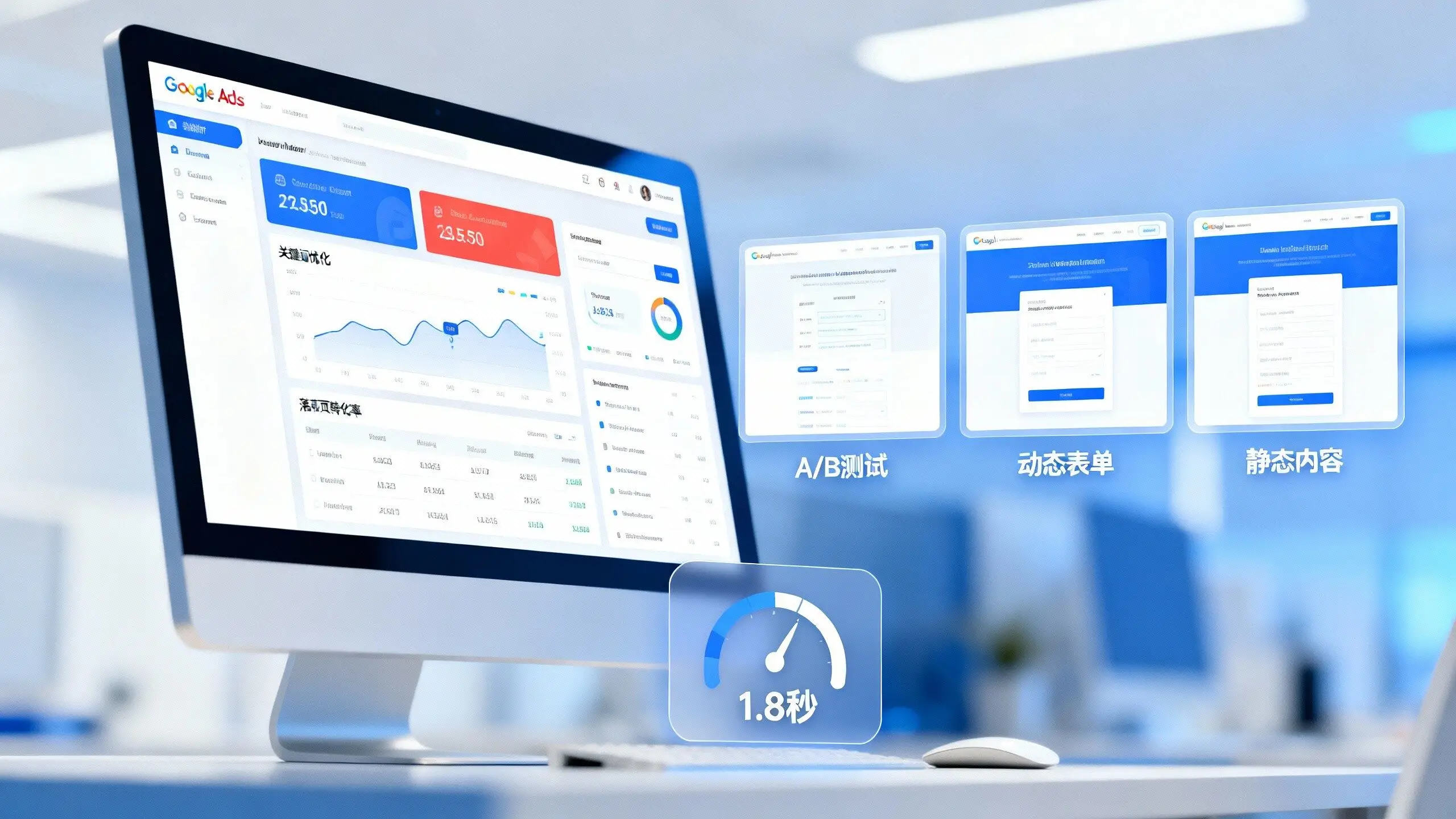
Clear Page Target: Transform Design around Inquiries
The B2B procurement cycle is longer and the landing page does not have to allow visitors to place their orders immediately, and the more realistic goal is to facilitate effective communication, such as the submission of request for quotations or the delivery of product requirements.
The different advertising groups should try to match different pages as much as possible. Searching for visitors with specific models and specifications and direct access to corresponding products and request for quotations; More selective information and application instructions are required for visitors to search for items or solutions.
It is easier for buyers to find information than to direct all advertising traffic to the front page of the website, to set up a corresponding page on the subject, and to analyse transformational effects.
Optimizing the first screen message: aligning advertising with page
The landing page should be clear and readable at the moving end and the first screen CTA should be visible without a large scroll; The forms should fit the keyboard of the cell phone and avoid too many mandatory entries. At the same time, check the speed at which the pages are loaded in the main market to reduce the impact of large maps, bullet windows and complex scripts on access experiences.
The first set of recommendations highlights three elements:
- Product positioning: A sentence describing the product or solution, and the main client.
- Product Pictures: Using a clear product picture to show real details.
- Request entry: Sets a visible CTA, such as ReQuest a Quote.
The English page suggests the use of concise subheadings, such as product summaries, key specifications and other details of the product. Product units, authentication names and MOQ (information should also be expressed accurately).
Show product parameters and application scenarios
Overseas buyers usually compare the product information of different suppliers. The page should be based on key parameters such as product characteristics presentation type, material, size, public transport, capacity, authentication, start-up, packaging and transfer.
Product advantages are expressed as concrete facts as possible. For example, where real data are available, it is possible to indicate the range of product spreads rather than simply "high accuracy" ; Instead of writing "support customization", it is preferable to list custom sizes, materials or processes.
Parameters answer “is it possible to do it” and apply the scene to help the buyer judge “is not fit”. Specifications, drawings or authentication documents could be provided to facilitate further checks by the purchaser, by industry, equipment or using the environment to describe the use of the product.
Adding the element of trust: demonstrating real business capacity
In addition to focusing on products, buyers assess the reliability of suppliers. The page can be shown on a practical basis:
- Product certification, testing reports and licensing bodies;
- (b) Photos of real production equipment, workshops and quality checks;
- Project cases in the relevant industry or area;
- Quality control process, after-sales policy and delivery instructions;
- Business address and contact information.
The case can be presented in the order of “customer demand—solved solutions—delivery”. The authorization to use shall be confirmed when the name of the client and the project picture are involved.
True cases and verifiable information are more conducive to confidence-building than advocacy words such as “multi-year experience” and “quality above all”.
Optimization Query entrance and CTA
The form field should be structured around the information required for follow-up on sales, with common features including name, workbox, country or area, product demand and number of specifications.
If the product requires detailed parameters to be quoted, an additional description of the demand or document upload may be added; If the target market clients are more accustomed to instant communication, the WhatsApp and Mailbox entrances are also available.
CTA should be clear, for example, by requesting quotations. Following a successful submission, the follow-up contact process and expected response time can be indicated on the thanks page.
Track data and continuously optimize the landing page
The site page of the B2B site cannot be judged solely by visual effects, but also needs to be combined with actual conversion data.
The recommendations focus on:
- Number of forms submitted and conversion rate;
- Click on the contact entry for whatsApp, e-mails, etc.;
- (b) The performance of the information boards brought by the different advertising groups;
- The leakage between the form and the submission;
- The cost of a valid query and the quality of the clue.
It needs to be noted that whatsApp clicks do not amount to a valid query and the submission of forms does not necessarily constitute an order. The quality of the lead should be judged in conjunction with the results of the follow-up on sales.
Optimization can be tested item by item for first screen cases, product parameter presentations, CTA positions and table fields. The test cycle should be judged in conjunction with the number of visits, the number of conversions and the B2B procurement cycle, rather than a small amount of data to determine a better version.
How to design the Google Advertisement Page on Foreign Trade
Q: The longer the Google Advertising Page goes, the better?
A: Not necessarily. (a) Products with complex parameters and more customized requirements need to be more fully described in terms of specifications, applications and delivery capabilities; Standardized products give priority to the presentation of core parameters and request for quotations. The page length should serve procurement decision-making rather than adding to the content.
Q: Can you use the first page of the official web site as an advertising page?
A: Not entirely impossible, but the front page usually needs to accommodate multiple categories of visitors and information topics are more dispersed. For product or demand-specific search advertisements, it is usually more appropriate to link to the corresponding product page or thematic drop-out page and to reduce the number of steps taken by visitors to re-see information.
Q: How long will the impact be visible after the change of the landing page?
A: No uniform fixed cycle. The tracking needs to be confirmed and accurate, combined with page views, conversions, advertising flows and procurement cycle observations. In particular, B2B pages, which have a relatively low flow, avoid early conclusions.
Operational recommendations
The main focus of the Google Advertisement for Foreign Trade page is to provide buyers with a quick understanding of products, parameters, applications and enterprise capabilities and to find clear entry points for requests for quotations.